 |
||||||||||||||||||||||||||||
 |
||||||||||||||||||||||||||||
|
|
||||||||||||||||||||||||||||
|
||||||||||||||||||||||||||||
|
 Inserting TabStrip
Control into Your Project Inserting TabStrip
Control into Your Project
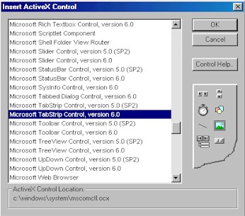
Right-click on the RadVC toolbox and select the menuitem "Insert ActiveX Control". This will display the ActiveX control selection dialog. Scroll down the list of the ActiveX controls available in your system and select the item "Microsoft TabStrip Control, version 6.0", as shown below.
Once you insert the control in your project by clicking on "OK", RadVC generates 3 wrapper classes for the control in your project. These are:
The control consists of one or more Tab objects in a Tabs collection. At both design time and run time, you can affect the Tab object's appearance by setting properties, and at run time, by invoking methods to add and remove Tab objects. Associate the ImageList Control with the TabStrip ControlTo identify a tab's function, you can assign an image from the ImageList control to the Tab object. You must first associate an ImageList control with the TabStrip control. To associate an ImageList control with a TabStrip control at run time simply set the ImageList property to the name of the ImageList control, as shown in the example below: void CForm1::Form_Load() { // set the imagelist // The tabstrip control is named m_Tabstrip // and the imahelist control is named m_Imagelist m_Tabstrip.ImageList = m_Imagelist.GetDispatch(); }
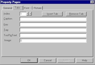
Create Tabs at Design Time or Run
Time
You can create Tab objects at both design and run time. To create Tab objects at design time, use the Property Pages dialog box. To create Tab objects at design time1. Click on the browse button [with caption "...", next
to the control name edit box] on the property window.
Create Tab Objects at Run Time Using the Add MethodTo create Tab objects at run time, use the Add method for Tab objects. Note One Tab object is created for you by default. The code below adds 2 tabs to a tab control void CForm1::Form_Load()
{
// Add tabs
// "Find_Image" and "Draw_Image" are two images that belong
// to an imagelist control
// You need to set the images before (either at design or run time)
// before you call the following "Add" methods
m_AxTabstrip1.Tabs.Clear();
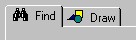
m_AxTabstrip1.Tabs.Add(NULL, _V("Key1"), _V("Find"), _V("Find_Image"));
m_AxTabstrip1.Tabs.Add(NULL, _V("Key2"), _V("Draw"), _V("Draw_Image"));
}
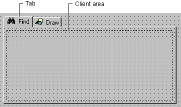
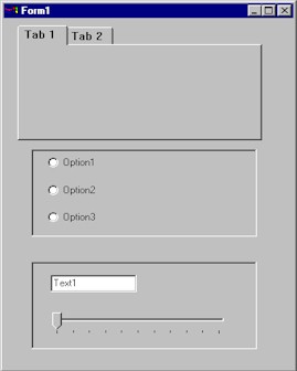
Here the first parameter is always NULL ("Index" of the tab). The second parameter ["Key1" or "key2"] is the "key" to the tab to be added. Assigning a unique Key property value to the Tab object allows you to create code that is easier to read. When assigning the Tab to a property, you can use its Key value instead of its Index value. The 4th parameter sets a image item for the tab item. Here Draw_Image and Draw_Image are the "key" values of two images that belong to an imagelist. The keyword "_V" is used to make VARIANTs used by the "Add" function. Use the Client Area to Position Container ControlsThe TabStrip control is commonly used to create tabbed dialog boxes. Each page in the dialog box consists of a tab and a client area, as seen in the figure below:
At run time, when the user clicks on a tab, you must program the client area to be reconfigured with a different set of container controls (discussed below in "Managing Tabs and Container Controls"). At design time, draw a container control, such as the PictureBox or Frame control, on the form. If you use a Frame control, you can set its BorderStyle property to be invisible at run time. Copy and paste the same control to create an array of controls; create one control for each Tab object you have created. On each container control, draw the controls that should appear on a tab. Your form may appear something like Figure, below:
After you have created the container controls, there is one additional technique required to position them over the TabStrip control's client area: use the Move method with the ClientLeft, ClientTop, ClientWidth, and ClientHeight properties of the Tabstrip control, as shown in the code below: void CForm1::Form_Load()
{
// Set the form size
Me.Width = 340;
Me.Height = 300;
// set the imagelist
m_AxTabstrip1.ImageList = m_AxImagelistctrl1.GetDispatch();
// Add tabs
m_AxTabstrip1.Tabs.Clear();
m_AxTabstrip1.Tabs.Add(NULL, _V("Key1"), _V("Find"), _V("Find_Image"));
m_AxTabstrip1.Tabs.Add(NULL, _V("Key2"), _V("Draw"), _V("Draw_Image"));
// Move pictureboxes inside the tab control
for(int nIndex = 0; nIndex < m_AxTabstrip1.Tabs.Count; nIndex++)
{
m_PictureBox1(nIndex).Left = abs(m_AxTabstrip1.ClientLeft);
m_PictureBox1(nIndex).Top = abs(m_AxTabstrip1.ClientTop);
m_PictureBox1(nIndex).Width = m_AxTabstrip1.ClientWidth;
m_PictureBox1(nIndex).Height = m_AxTabstrip1.ClientHeight;
}
HideAllTabs();
m_PictureBox1(0).Visible = TRUE;
m_PictureBox1(0).BringWindowToTop();
}
Here ::HideAllTabs() is a function that hides all picturebox controls. void CForm1::HideAllTabs()
{
for(int nIndex = 0; nIndex < m_AxTabstrip1.Tabs.Count; nIndex++)
m_PictureBox1(nIndex).Visible = FALSE;
}
Managing Tabs and Container ControlsA tabbed dialog box contains more than one Tab object. As seen above, a Frame control (or other container control) should be associated with each Tab object. To efficiently manage the numerous Tab objects and container controls, the following strategy can be used:
The code to bring the proper container control to the front would then resemble the code below: void CForm1::AxTabstrip1_Click()
{
m_AxTabstrip1.SetPtr();
int nSelIndex = m_AxTabstrip1.SelectedItem.Index;
HideAllTabs();
m_PictureBox1(nSelIndex - 1).Visible = TRUE;
m_PictureBox1(nSelIndex - 1).BringWindowToTop();
}
Tab Style Property: Buttons or TabsThe Style property determines whether the TabStrip control looks like notebook tabs (Tabs),
or push buttons (Buttons).
The advantages of each are outlined below:
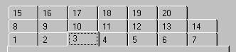
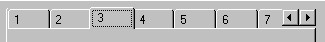
Multi-Row TabsAnother feature of the TabStrip control is the MultiRow property. When this property is set to True, a large number of Tab objects appear in rows, as seen in the figure below: . If the MultiRow property is set to False, the same set of tabs appears in a single row, with a pair of scroll buttons at the rightmost end:
The TabWidthStyle property determines the appearance of each row, and, if TabWidthStyle is set to Fixed, you can use the TabFixedHeight and TabFixedWidth properties to set the same height and width for all tabs in the TabStrip control. |
||||||||||||||||
|
|
| [ Home ][ Order Now ][Feedback][ Contact Us ][ About CapitolSoft ] | |
| [ Features ][ Tutorial ][ Samples ][ F.A.Q.s ][ Download ][ CDK ] |